The web browser is one of those things that we rely on to “automagically” do amazing things for us. Show me how to find coffee nearby…now! But how exactly does it turn code into pixels? CodeNewbie invited Lin Clark, an engineer at Mozilla, to tell us all about it. Here’s what we learned.
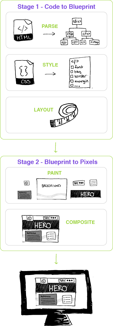
There are two stages. Stage 1 is turning your code into a blueprint. Stage 2 is taking that blueprint and turning it into pixels. Let’s walk through each stage.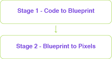
STAGE 1 - MAKING A BLUEPRINT
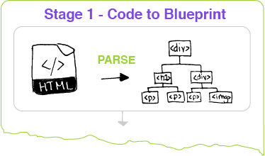
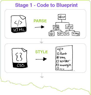
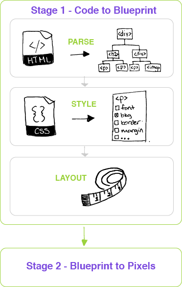
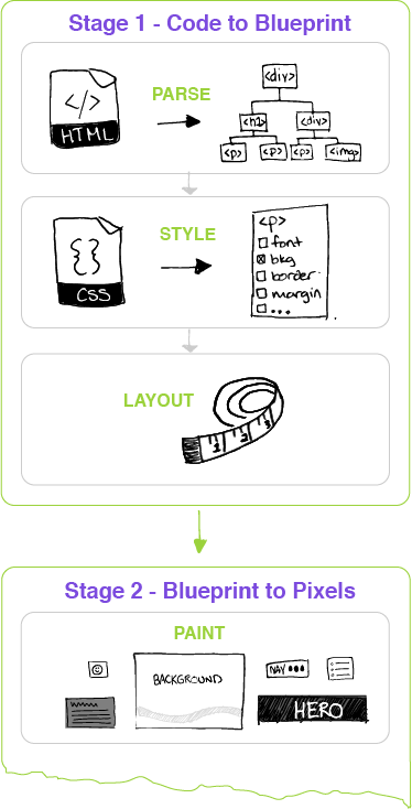
Step 1 - Parsing
HTML arrives in the browser as one long string. The browser cuts it into individual elements: headers, paragraphs, unordered lists, etc. Elements are arranged in parent-child relationships like a family tree.
This tree tells your browser the order of elements from top to bottom, and which elements will need to be nested, one inside of the other.
For example, let’s say you have a div with a bright purple background and you put a paragraph inside that div.
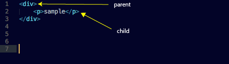
The parent-child relationship here means the child (your paragraph) will get the same background color as its parent (the div).
Sidenote: Lin drew a fantastic illustration of the HTML parsing process. (See the full-size cartoon here.)
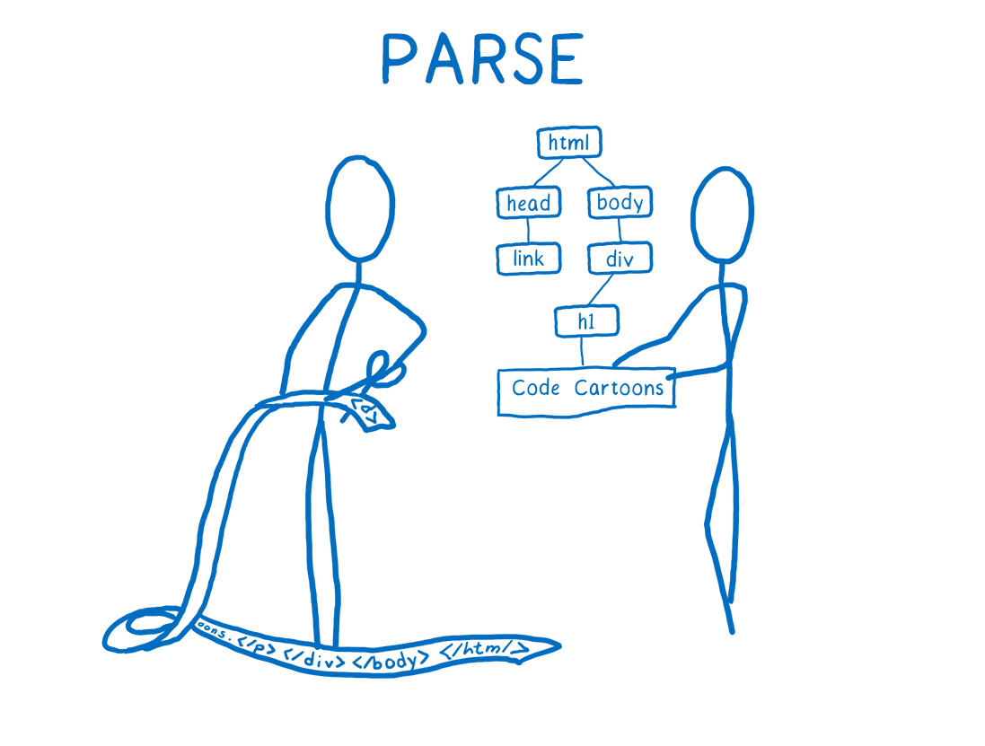
When every element is mapped out in relation to the other elements, the resulting tree is called the Document Object Model, or the DOM.
This is the very first step on our way to showing your code to the world!
Step 2 - CSS style computation
After your HTML has been converted to a DOM tree, the browser moves on to a new task. It’s time to look at your CSS. This is the code that tells the browser what colors and fonts and borders you want.
Lin suggested a helpful way to picture this step. “I think of that kind of like a person filling in a form for each of these elements that's in the DOM tree. And the form's going to say what the element should look like.”The form has a blank for every single one of the CSS style attributes -- more than 200 of them!
Even the styles you didn’t choose to apply are listed on the imaginary form. The browser needs to know whether to dress up your elements with styles that you picked, or use a default. The browser is very diligent. It checks all the styles to complete the form for each element.
And that wraps up Step 2! Let’s add it to our diagram below HTML parsing.
Step 3 - Layout
Now the browser has structure and style information pieced together for each element. But how big is each element? In responsive layouts, we often code sizes in percentages. For example, we can make a box that’s 50% wide. Whether we put it on our large laptop and our much smaller mobile phone, the box will always take up 50% of the space. But those two screens are very different sizes. And while 50% is helpful for us, the browser needs to know how many pixels it can use to show you the box. How does the browser get that number of pixels?
Layout is the step that solves the sizing problem. The browser checks the window size in our display, then calculates what the height and width of each element should be.
Let’s add layout to our diagram to wrap up Stage 1. Our code has now been converted to a blueprint. It’s called a frame tree, render tree, or box tree.
Note: At this point, we still haven’t shown anything to our user. But that’s about to change! Up next is Stage 2, where the browser can use the blueprint to make the website that our user can actually see.
STAGE 2 - TURNING THE BLUEPRINT INTO PIXELS
Step 1 - Painting
It’s time to make something beautiful happen! Stage 2 is where plans become pixels.
The first step is called painting. To envision how this works, Lin recommends thinking of the screen as a piece of graph paper, where each square represents a pixel on your screen. The browser assigns a color to each pixel on the screen, according to the blueprint from Stage 1.
Square by square, your website elements take shape. The process is nearly done!

Each element -- paragraph, div, heading, img, etc. -- is painted separately.
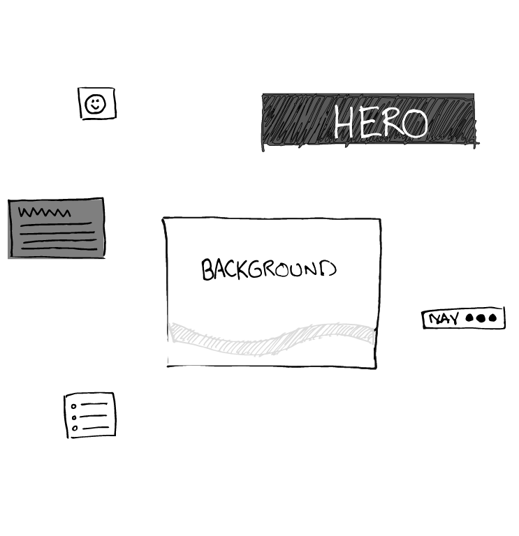
Let’s add some sample website elements to the diagram.
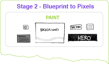
Here we have a background, some articles, a hero image placeholder, a navigation bar, and a profile picture, in no particular order. Now let’s add it to our full diagram.
One more step to go!
Step 2 - Compositing
All the elements are put together in layers now — your background at the back, menus and body content on top, etc. Some layers will cover other layers, like when you’re making a scrapbook.
In CSS, you can set the order of the layers using the z-index property. A low z-index pushes an element back toward the background. A high z-index will keep an item on top. For example, you could give your background a z-index of -1, and set your logo to be 10.
Once layers are set, the browser takes a snapshot. The output of that snapshot is what you see on your screen.
We made it! The full process looks like this:
AND IT DRAWS AS FAST AS YOU SCROLL
The browser is checking for updates every 16 milliseconds! Every time you scroll, highlight, or click, what you see changes, and the browser is redrawing pieces of the webpage.
To learn more about how the browser does so much, so quickly, tune in to Season 2, Episode 2 of the CodeNewbie podcast.

